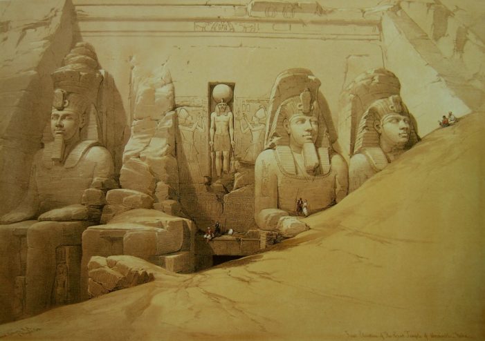
After quite literally decades of passionately loving Egyptian art and architecture, and of knowing about these particular statues, looking at this painting brings something up.
I know, I’m with you. I’ve only ever seen it written as “Abu Simbel.”
But it is literally written as “Aboosimble” on the front of the piece, according to the Library of Congress. In fact, you can just barely make out the writing in the bottom right corner, especially if you visit the larger image at the link below. It’s a testament to what David Roberts was going for when he created it, a record of the temples and statuary that he saw on his journey through Egypt.
Many of Robert’s Egyptian pieces come across as exactly that, a journeyman’s sketch record of the various art and architecture he found in Egypt. You have your “Perspective” images, your “Profile” versions, and this one, the “Front Elevation.” Compare the two images below, the first a close-up of part of his painting, and the second a black and white photo taken sometime before 1923. Roberts clearly captured the essence of the statues and the setting, down to a near-mirror image of the crack where the missing statue would have been:
There are certainly artistic sways to and fro, but his accuracy is truly astonishing. Roberts not only captured the sense of being there, but accurately captured the details as well. He used time honored tricks for showing scale as well, such as the fine folks shown in the close-up below. They don’t seem very interested in being so close to these epic statues, I guess that’s not the reaction I would have personally.
I think my reaction at being in Egypt looking up at these enormous statues would be along the lines of, “Ohmygodohmygodohmygod.” Or something.
But as much as I appreciate Roberts’ extraordinary accuracy, especially as I am an ink artist that has spent years working in intricate detail and accuracy, it is the true artistry that Roberts brings to this piece that sets it apart. In the second close-up of the painting, note the crosshatching on the stone next to the lower gentlemen. Compare that to the softer stone in the first close-up, around the crack.
The differences are in the texture, and the treatment of the stone, and yet both styles fit here perfectly. The lower crosshatching gives a sense of the sandstone, and the lines cut into it. It reveals stone that was manufactured to look like it is, hewn by man. The broken, weathered stone has a wonderfully soft, natural texture to it, softer than even the photo shows. When you lean back away from the close-up to take in the whole image, you realize that the softness of Roberts’ weathering technique contrasts beautifully with the sharp cracks and lines of the man-made work.
In essence, Roberts has captured what it is like to truly be at Abu Simbel (notwithstanding it isn’t in the same spot any longer). It is a place created by nature, molded by man into fantastic and elegant art, and weathered back down again by nature. Roberts, in a single piece, captured the magnificence of both ancient Egyptian culture and the natural world surrounding and within it.
See previous editions and subscribe to new articles here.
References
- See the lithograph and other info in the Library of Congress
- See it MUCH larger on Wikimedia
- Haghe, L. & Roberts, D. Front elevation of the Great Temple of Aboosimble Nubia / David Roberts, R.A. , None. [Published between 1846 and 1849] [Photograph] Retrieved from the Library of Congress, https://www.loc.gov/item/2002718662/.
- en.wikipedia.org/wiki/David_Roberts_(painter)
- artmight.com/Artists/David-Roberts-1796-1864/David-Roberts-Colossal-Figures-In-Front-Of-The-Great-Temple-Of-Abu-Simbel-52647p.html


