One thing I love about art is seeing the different interpretations that artists have. A different take on a sunset, or a new way to paint buildings, and even new ways to paint monsters. These new methods and creative views drive what I love in art. Let’s face it, especially where monsters are involved.
It can be tricky, especially if the basic idea of a type of monster is fairly well laid out. Since Zombie Month is upon us here at Apex (and it’s just eating at me to talk about it), we can take a look at the dead. Also, I’ll try to avoid further “eating” phrases.
| Originally published by Apex Book Company, July 2013 |
Zombies, of course, are the reanimated dead. That doesn’t give an artist much to work with, really. Sure, there are different methods and stages of the corpse and its initial death. There are even games like Left 4 Dead that offer up mutated versions of zombies.
But at the end of the day, we’re just talking about dead bodies. No tentacles. No racks of sharp, pointed teeth in their mouths, or big claws waiting to rend flesh. It’s just a dead body.
The trick for an artist becomes how to differentiate zombies from normal humans, and it usually comes down to a sort of “texture” of zombies. There’s a look and a feel to certain styles, from subtle to wildly gory, and everything in between. Stories will vary in how the zombies were created, or how they should look overall across an entire story. The look has to be consistent, or else the visuals and the whole story you are telling can be affected.
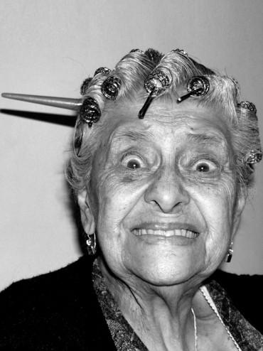
Let’s take a look at the way zombies looked in the mid-20th century, up to, say, Night of the Living Dead. Here’s a simple photo of this woman. It’s kind of a goofy smile, but we’ll roll with it.
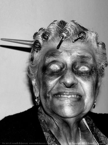
Here’s an example I cooked up of this nice girl, zombified for a simpler time. We shall call her Nancy (or Zombified Girlie Woman Deadie, your choice). She simply has darkened areas around her eyes, and a white, glassy look in her eyes. Definitely like Night of the Living Dead:
You might see a little blood around the mouth during this era of horror, maybe even a part broken or missing. But it really came down to a more subtle difference. In some ways, the subtlety could be more compelling, since it would be much more difficult to easily spot the living dead.
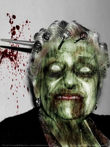
Over time, more detail and decomposition textures were added, and more and more zombies in art and film started to look quite grotesque. That can be accomplished in a number of ways, depending on what you are looking for. You might end up with greener skin, and undertones of veins and other subsurface structures:
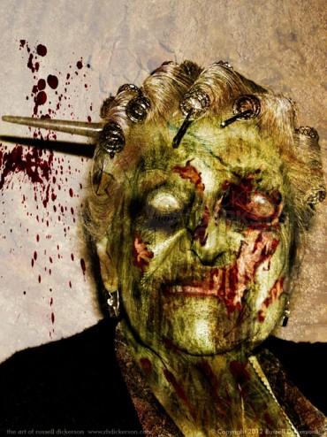
You can also add areas of skin that have come off, to the point of showing the skull underneath:
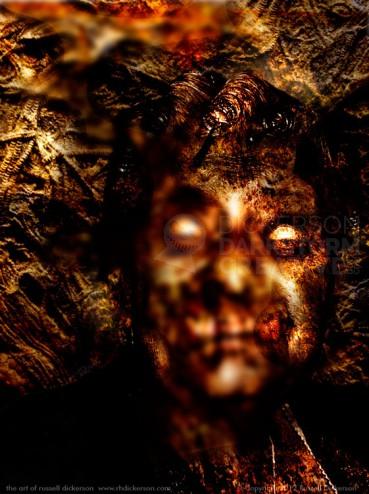
You can even go full-on, wild horror:
There are hundreds of ways to pull off how a zombie looks, and each story is going to have unique requirements on how they should look. For some stories, the idea that the dead are very close to us physically might require a more subtle look. You might need your dead to look shockingly grotesque, to smack the viewer around a bit while the story is in motion.
But those methods would look terribly out of place in the wrong environment. Take the very popular Walking Dead show, for example. A subtle zombie, hardly dead at all, wouldn’t seem like a threat with all of the other gory creatures in the show. It would almost be like a commercial break.
On the other hand, one of The Walking Dead‘s gory zombies, with arms missing, jaws missing, even half a torso eaten away, would shock you right out of the realism being portrayed in the original Night of the Living Dead. It would be such a shock, you’d get pulled right out the story. It would no longer be a show about survivors of this catastrophe, but more about horror and monsters. The viewer would miss the point of the idea, and you wouldn’t care at all at the end when [REDACTED] and then they [REDACTED] with the [REDACTED] and the poor [REDACTED].
If the art doesn’t fit, the story suffers, and you end up with another in a long line of forgettable, cliched horror stories and films. If the texture is right, if the look and feel of the dead work with the story, then you have something special to appreciate. Something to be remembered, and maybe even feared.
