Just the other day, Thunderstorm Books posted their newest book, Bryan Smith‘s Grimm Awakening. I was lucky enough to do the cover art for it, which was a great thing for me because I also did the cover for the original version way back in 2004.
It’s not often that an artist gets a second shot at the same work, and coming eight years apart was fascinating. It’s a great story, and Bryan’s writing with the character of Jack Grimm has been some of my favorite writing of any story. I jumped at the chance to do another version of it, especially after learning so much in those eight years.
However, there’s always a chance that I could mess it up. I might have become so enamored with doing it again, to challenge a highlight from the early part of my career, that I would be too worked up to do it justice. Of course, that’s up to you and to those who bought the book, not to mention the author and the publisher.
Part of the trick was that the original cover has always been one of my favorites, and the image for the cover is truly ingrained into my psyche. That alone can be a trick to overcome, and to still try and make it a unique, new piece of art was always overhead.
Here is the original cover, which I did for Undaunted Press way back in 2004. Editor/Owner Cullen Bunn, who has since gone on to create the great Six Gun comics and works for Marvel Comics, was great to work with, and really helped me to find my legs (so to speak) in the art and publishing world.
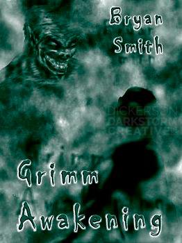
In the story, the wolf-looking creature changes very rapidly from a stocky man into a hellhound. I wanted that mystery, and the overwhelming power of the creature over our hero (the shadowed man). I would approach it differently now, but I still stand behind the idea and the art itself. It conveys the dark mystery of the hell they are in, and (hopefully) intrigues the viewer enough to pick up the book and find out what’s going on.
Eight years later, and a couple of Grimm stories later (including one that I illustrated for Apex Magazine back in 2005), and I have a different idea of how the story of Grimm should go. It strikes me as more adventurous, yet still retaining that grit that makes the story so great.
Back then, I approached art a little bit differently. It was more about the individual scene, versus the entire book. I was very interested in getting the scene just right. That hasn’t changed per se, especially with art that appears within the story itself.
For a cover, though, I’ve learned to balance the need for accuracy with an overall sense of the entire story. I still want to keep things accurate, sure. But I also want to toy with colors, angles, and textures to get the overall idea of the story viewed as well. That can be very tricky, but hopefully I’ve pulled it off.
So, let’s start talking about the new version.
I didn’t want to use the same scene at all. For one, it concentrates more on the secondary character than on Grimm himself, though I didn’t want to jettison the hellhound completely. The character has a certain, “sass” as well, something I didn’t capture in the original version since, again, it was more focused on the hellhound. But it’s most often a subdued, “beaten” sense, which can be tricky.
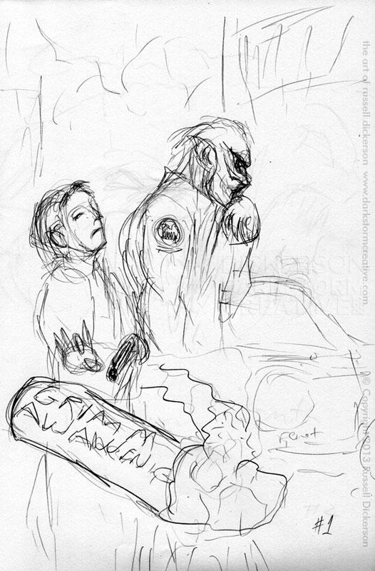
Here’s the accepted first sketch, featuring not only the characters but a sense of the environment they are in as well:
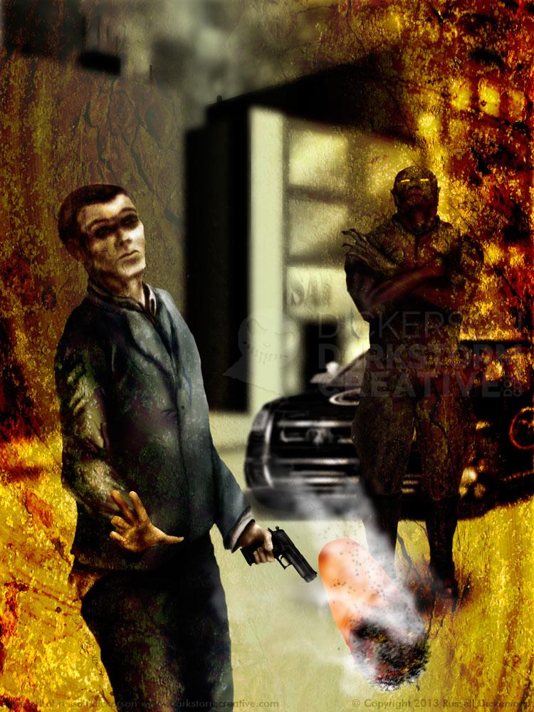
Now, I realize it’s rough, so here’s a bit of an explanation. Grimm and Lucien (the aforementioned hellhound) are walking next to Lucien’s car (it’s explained), and Grimm is flicking his cigarette butt at us. After approval, I went ahead with creating the final art. Here’s how that came out:
I changed a few things from the sketch, mostly after realizing that the way things were aligned didn’t quite work. The cigarette would really have been drowned out being within the character areas, so I separated them. That let the cigarette become a split, which fit the story well. It’s a split between these different realms, a split between the characters as Grimm works on his personal demons (sorry for the pun), and, from a design perspective, leaves plenty of room at the top for the title and author.
I’ve also learned over the years that, while the textures are great, they need to work with the scene quite a bit more. It’s not just that the fog in the original hides everything, it’s that it seems separate from the characters. On this reworking, I wanted it to all feel cohesive. I wanted to use those textures to roughen up the smoothness, and even vice versa. In this case, the orange-ish texture is a real element in the story, though I’ll let that come to you when you read it.
The environment really needed to exist as well, far more than the first one (where it really didn’t show at all). The feel of the places they go, as perfectly written by Smith, deserve a voice. Hell is written as just slightly off from our reality, so the environment on the cover needs to reflect that.
It was great to revisit the old project, and make it new again. Smith is a hell of a writer, and Thunderstorm a fantastic publisher, so I was honored to give the cover a shot again. I’ve learned so much, and I hope that it shows in the new version.
What do you think?
