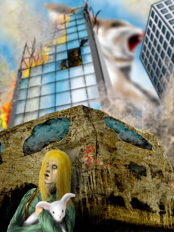
Every so often, I get some idea rolling through my head that I just have to investigate. On this site of mine you’ll find experiments as dark as The Lost Nightmare, as wacky as zombie muppets, and many others that I just thought would be fun.
After a discussion online earlier today with artist Chris Zenga, one of those things clicked into my head. I stopped my cover editing and ebook creating to give it a shot.
I don’t get to play many games, but I do have a number of games from the game company Valve. That includes the zombie game Left 4 Dead 2, which I fire up every so often to shoot some monsters and such. One of those zombie monsters is known as a “boomer”, a great big obese one that will puke all over you. The puke (lovely conversation, right?) clouds your vision, and all the other zombies run over en masse and try to kill you.
Being that it’s Christmas, and Santa is coming soon…
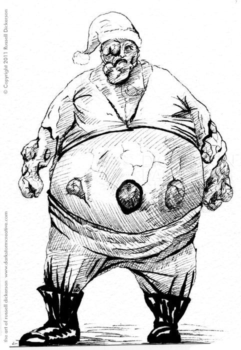
Yep, I created a “Boomer Claus” parody ink. To be fair, the creature was always in mind for Alphabeasts, but I decided the Brundlefly was cooler.
Here’s the ink version, 5″ x 7″ on 140 lb. Cold Press:
Since this one was a little unexpected, I decided to toy with it a bit. After making it a greeting card for the holidays (which I thought was funny, you can buy it here), I set about to add color to it. (Note: Zazzle pulled it from the store, explaining that it infringes on copyright. I guess they haven’t heard of fair use parody rules.)
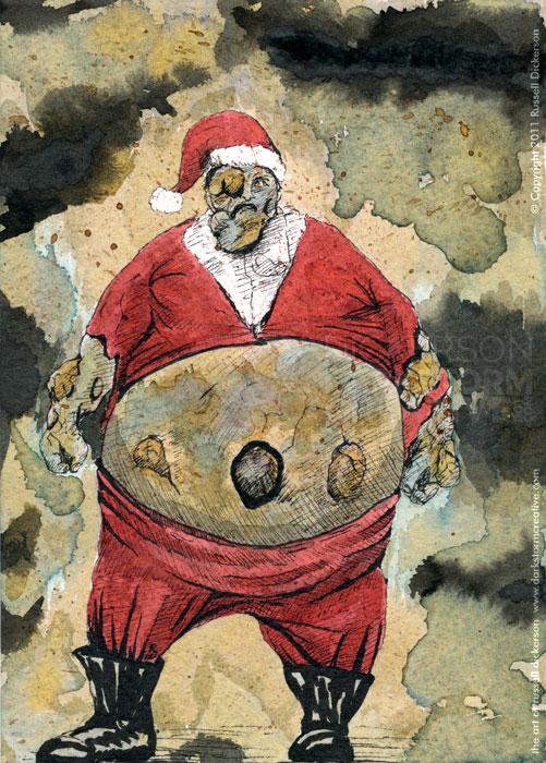
Instead of digital color, I literally said, “what the hell” and started painting in color inks to it. Some were washed ink, others simply brushed in (or even by dropper), just depending on the effect I was looking for.
Here’s the color version of Boomer Claus:
It was quite a lot of fun to create (and a bit of catharsis, even if it’s only Tuesday it’s a long week already). Many layers of ink, trying some new techniques, and overall just letting things go and being an artist. Headphones blaring on and on, of course.
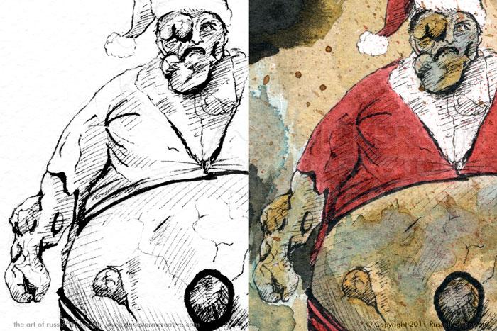
It’s interesting, I always feel that the two ideas are totally different, between the ink versions of things and the color versions. It’s not that one is better than the other, they just have such different feelings. Even in the case of this one, where it’s the same black ink lines as the original, the color just creates a new piece altogether.
Here’s a split of the two:
It’s almost like seeing two different pieces of art, rather than just another version. The colors and the textures just add a realism to it, even though it’s not a realistic image at all. My imagination is a bit more fired on the ink version, but the sputter of emotions comes from the color version.
What do you think? Comment below and let’s discuss it, or find me on Twitter/Facebook/Google+.
