For a long while (for those who haven’t followed me for that long), I would do weekly art blogs about paintings that I was inspired by. Works by artists who are now among my favorites, like Caspar David Friedrich, Arnold Bocklin, Thomas Cole, and many others. You can see the original set gathered here.
Between the unemployment situation, getting freelance art off the ground, and life in general, I stopped doing them for a bit. But, they are really beneficial, as I learn a great deal from how other artists have created their works. Some of the posts too, are very popular with other artists as far as traffic is concerned, so I’ve decided to start doing them again.
Now, as much as I do know about art and art history, in no way am I claiming to be an expert. I’m not here to talk about the history of the artist (for the most part), or certain movements, or that kind of thing. At the end of the day, I’m just someone who’s fascinated with art, and these articles approach everything from the angle of someone appreciating the work. I’ll talk colors, techniques, and so on, but only as I see it. The posts are more for everyone, not just other artists, so I might stray away from the very technical terms I might otherwise use. For example, instead of going into “chroma”, I might just talk about how I “like the use of red” in an image.
Also, unless I’ve taken the photo myself, I’m limited to the views of art and files found on the web. While this normally works just fine, I have run across pieces that have different color variations, contrasts, and other such things. So, grain of salt, if you see that the image I have doesn’t represent what it looks like in real life, let me know.
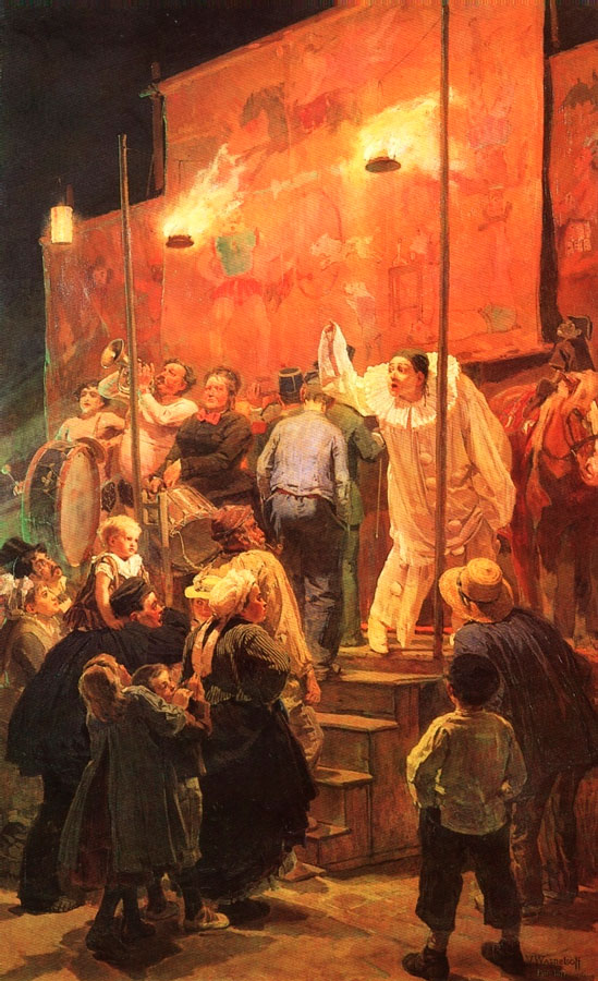
First up in this regenerated idea of art talks, a painting by Victor Vasnetsov:
This is Acrobats (aka Festival in a Paris Suburb; 1877, Oil on canvas, 87″ x 54″), and both the red and the contrast Vasnetsov used caught my eye immediately when I was looking for new pieces to talk about.
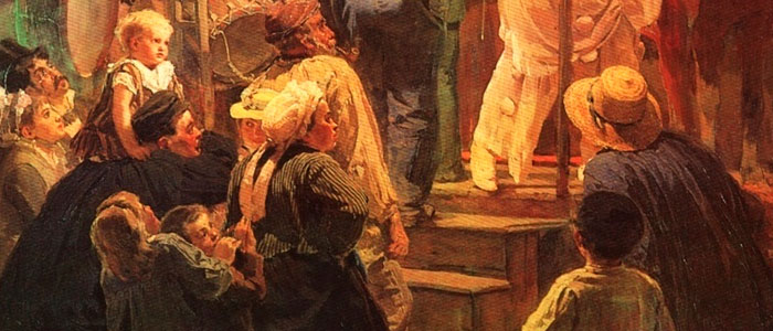
I looked at quite a few of his pieces, and Vasnetsov was able to add a lot of details to images, and yet in other areas keep it pretty loose. For example, in the crowd there is a lot of detail, down to the lines of the woman’s shirt:
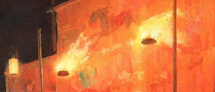
There are also details like the glasses the man on the left is wearing, or the subtle lines in the hat of the character in blue just to the right of the stairs. When you look above the stage, he’s left the designs of the stage set, and even the fires lighting the way, much less defined:
That effect causes the eye to go right to the center of the piece, almost like a line separating the set, the unreal world, from the reality of the audience below. Your eye balances in the center, then can take in the darker areas to the bottom and the lighter areas to the top.
That balance works nicely, and even with the very bright lights above you aren’t overwhelmed by them. Had the top been just as detailed, you may have easily become lost in piece, and it wouldn’t have held together as well.
I like the reds and oranges in the piece, it gives everything such a warm feeling. Where the colors in the crowd are a bit more subdued, on stage that fiery color really sets the idea that this is something different. This is a change from the audience’s normal life, and all eyes are on the players on stage.
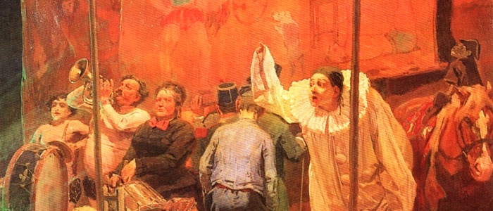
The players themselves are quite varied:
You have the central character, acting out either a dramatic or humorous piece. You have some of the band merely playing, others excited, and the woman with the red bow tie looking almost upset.
I like that Vasnetsov lets the other players blend into the stage, into the red, leaving the bright main actor as the strong piece. Combined with higher contrast in the crowd, you get a sense that these groups are separate. Even the man going up on stage (as it appears to me) seems to be entering the world of the players, leaving behind the rest of the crowd.
Overall, I think it’s a great piece of art, and one that really grabs your eye. What do you think?
