I’m fascinated by creatures of all sorts, especially those that are a bit on the creepy side. Case in point, “The Mouth of Sauron”, featured in the extended edition of the film The Lord of the Rings: The Return of the King.
In case you haven’t seen the extended versions of the LOTR trilogy (which you should, they are fantastic), here’s a YouTube link of just that scene in the film. Of course, if you haven’t seen the film, there is certainly a bit of spoiler here, so if you’d rather watch the full film first please do. Otherwise, here:
Creepy, definitely.
So I decided for my next ink work to try creating him. I thought about doing a smaller, more cropped version using my 5″ x 7″ stock, but in the end I thought the expanse of black would help show it more and went with 9″ x 12″, horizontal.
While most of my art is generated from my head, with sketches and the occasional model (of various kinds), the ink project in the last year has been working with photos and models specifically. It’s a plan to help my other works by attempting to recreate something that already exists.
By doing so, I’m learning quite a lot about how light interacts with objects, more than just what the rules say should happen. There’s also a sense of “chaos” when working with an object or a photo, since folds and other parts in the image might fall differently than expected.
I never truly copy the photo, it’s only a start and a reference point for the final image. Frankly, why copy it, why not just stick with the photo? So I stray as I create lines, and new shadows, and end up with a piece of art that, while similar, is also “me”.
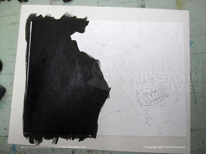
On to the art. I start with lines here and there, where I think the major sections should be. Sometimes, as with the Mouth of Sauron, that’s pretty easy. You can see from the video that he has lots of shadow areas and very well defined lines, making it easy to choose places to start with.
I normally outline the areas with a very thin pen, normally a Micron .005. Even then, I leave the lines very loose and not very dark at all. It’s a hint of where things should be, but often as I go I shift them one way or another, and really dark lines would kill that.
Once those major lines are in place, I can fill in the black background in the open area. I go back and forth on most pieces, sometimes using my PITT brush pens and sometimes I just brush on ink with a paintbrush. In this case, I brushed it on, and helped details closer to the character with the PITT brush as needed.
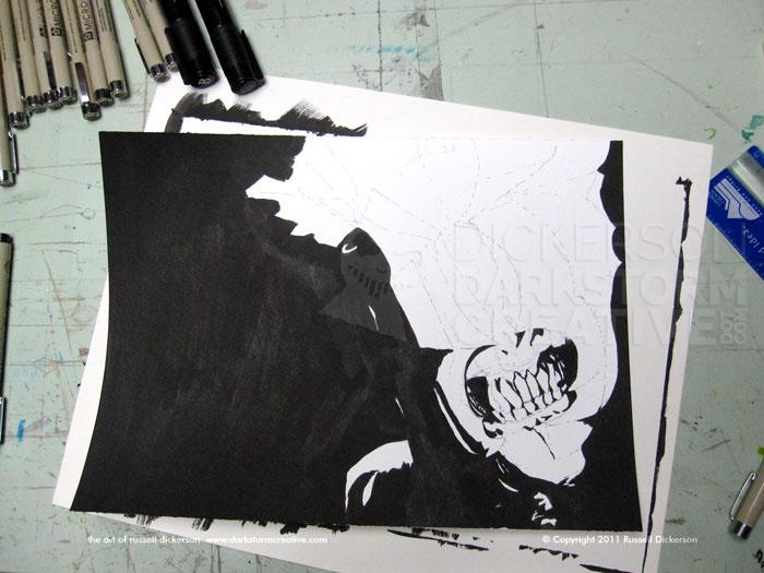
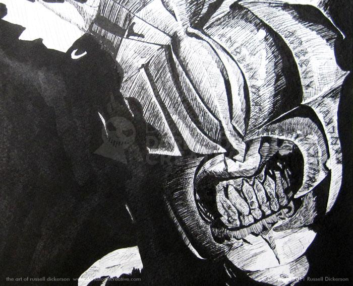
Once the background is tightened up a bit more, I can add in darker ink areas around the mouth, to start defining it:
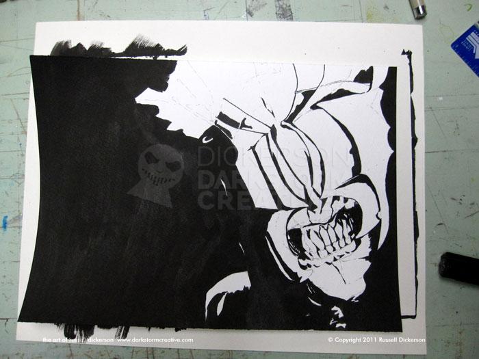
From there, especially since the character’s helmet has several lines in it, I can delineate that as well. I usually use a decently thick pen, if not a .08 Micron than a .05. This is also the point of no return, where I tend to start thinking that I should give up doing ink art, and that I’m not any good at it.
The problem with this stage is that it’s so basic. It throws me off sometimes, even though I know we’re still just in a “set up” stage of sorts. But, I press on, adding here and there.:
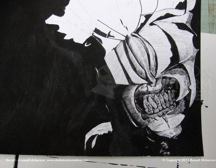
After deciding to move forward, I start adding smaller areas of detail with crosshatching. I tend to crosshatch with smaller Micron pens with lots and lots of lines, usually with Microns .02 and .03, though you can see areas where I left it pretty open with thick lines as well.
The last pen work was with the symbols that are carved into his helmet. They can be seen in the video, but they aren’t very easy to see. Thanks to the texture of the helmet, and the way he moves, you don’t necessarily get a good look at them.
After a lot of internet searching, I found a few sites that more or less took at stab at deciphering them. I added where I could, trying to match up the online ideas with the video, and came up with at least an approximation of the symbols.
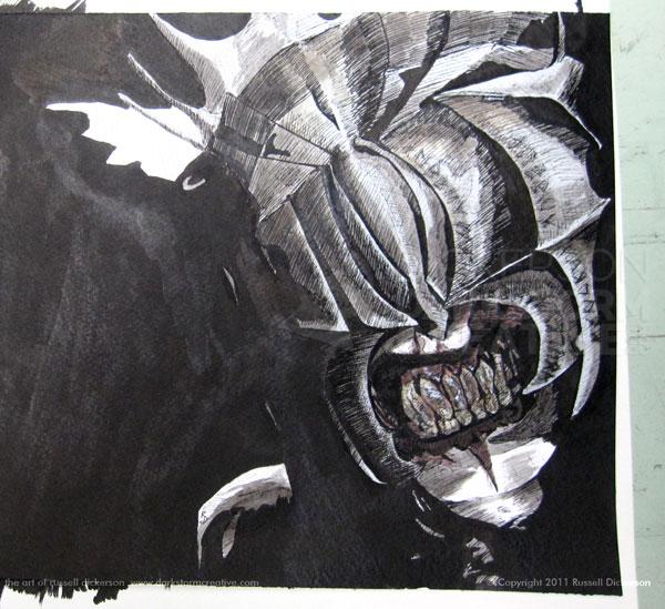
About partway through the inking process, I started thinking that using an ink wash on this piece might be pretty cool. After I was finished with the crosshatching, I grabbed a few brushes, and my various inks, and started trying it.
For those that are unfamiliar, an “ink wash” is where you take a dozen or so bottles of really crappy ink, go outside to the garden, strip naked, and start using the ink to wash yourself. Don’t forget your hair.
Of course, the other definition, and maybe the one that’s more relevant here, is that an “ink wash” is the art of using ink and water (or other solution) to brush the ink into your art. It’s quite similar to watercolor really, and the watered down ink can give you some great effects with shadows, and even color.
There are lots of ways to go about it, but I normally start with a very light ink wash. I mix maybe one drop of ink for twenty drops of water (totally a guess), giving me a very, very light gray. After testing it on a loose, old piece of watercolor stock, I get to it.
I like to put down lighter shades first, and then, as it dries, gradually build up darker and darker shades. You get a nice shadowing out of it, and not one that’s so harsh. But I’ve heard of folks that either try to get exact shades or start darker, so make sure you experiment with it some.
It’s a bit of a gamble at first, even trying a little area with the ink wash. It’s not like you can take it back after you do it, which is the value of having that old piece of watercolor stock laying around. After a quick test, and then just trying a small area of the art (which I could cover up later with crosshatching if it didn’t work), we’re off to the races.
I added some color ink here and there as well, for effect. I kept it quite subtle, my preference. Doing your own work, you might want it more overt, and more power to you. In this case, the wash softened and darkened all the right things, and leaving parts of the image as pure white/paper stock helps the contrast out a lot.
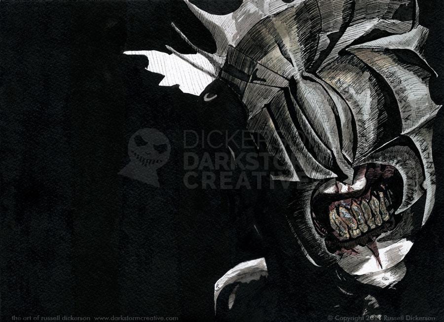
I went back and painted in a bit more black in the large area, then scanned it in. After a minor color correction to adjust for the scanner (and reflected light in the ink), here’s the final version.
I give you The Mouth of Sauron (click on it for a larger version):
1 Comment
A solemn moment and a quiet gift - The words of creator Russell Dickerson · Aug. 26, 2014 at 10:19 am
[…] well, as the Aurora Rise Benefit Event was happy to accept donations of both my original ink art (my Mouth of Sauron ink) and a signed, remarqued copy of a book I did a cover […]
Comments are closed.