In starting up my new online stores, I decided that it might not be a bad idea to have a few items that weren’t as much about my art as much as just “cool”. Being that, without a day job, I don’t get to play with graphic design as much anymore, I thought it would be fun to toy with typography.
For those reading this that aren’t designers, or aren’t familiar with the term, typography is using text and fonts in (hopefully) an interesting way in a design. I mean, you could just type out your information in a boring font, on one line, and hand it in. But I want to try something else usually with the design, something that “pops”.
When I was working the last few days jobs, I was labeled as the “tech guy” (this despite all my book covers, illustrations, and so on). Now, labels themselves very much oversimplify the abilities that people have, and in some cases are very degrading. There was nothing wrong with being the tech guy, after all my brain is quite evenly split between the creative and the analytical.
But it’s not all that I can do, and to assume that I can’t be creative simply because I’m decent at tech is what we in the business call “a load of horse hockey”.
Now that I’m free of the tech-only positions (and looking only for “creative” ones to replace them), I have a great freedom to explore design and typography the way I want. So, adding new, general items to my online stores, I’ve done just that.
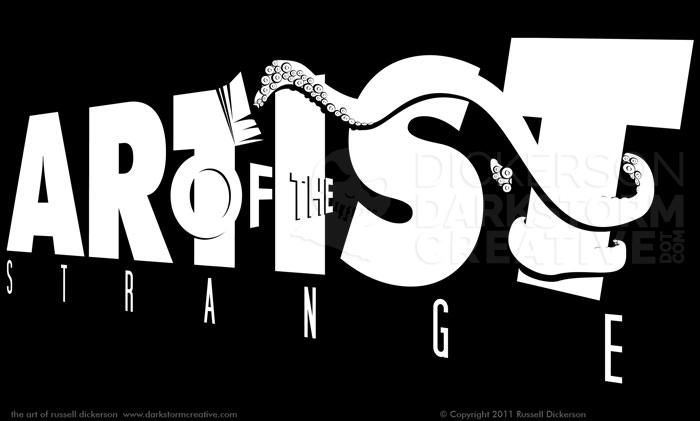
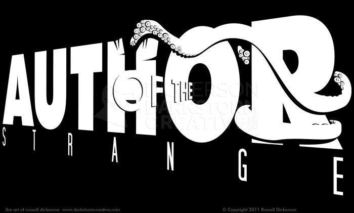
My first set of designs is a split between vector art and typography. I wanted something for people (myself included) that create “strange” things. They are for authors and artists alike that create things that are a bit odd, a bit unusual, and things that they are proud to show off.
Here are the “Artist of the Strange” and “Author of the Strange” designs:
Along with the angle and the perspective of the text, I wanted to toy with the shadow play as well. Instead of just a generic “artist” or “author” shirt, I wanted to go a step further, and give an idea of what kind of work I do. “Strange” fits pretty well, as it can cover really everything from horror, to sci fi, to fantasy, anything that is just a bit outside the norm.
I also left it as a one-color piece. That simplification lets the text and art speak for itself, and color may have influenced it the wrong way. Say, if I had colored in the tentacle, then you’d be looking at that and not the “Artist”. Color in the “Artist”, and the viewer might just skip the rest completely. Leaving it as all one color gives the viewer a chance to explore, and stick with it.
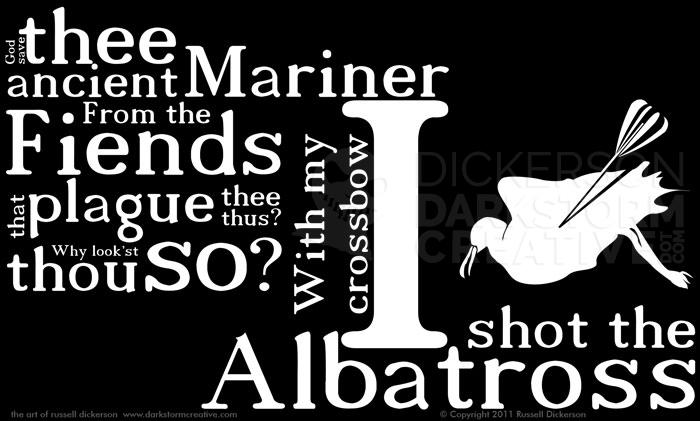
The other one I did, which I hope to do more of, is much more about typography than art. One of my favorite works is The Rime of the Ancient Mariner, by Samuel Taylor Coleridge, and I decided a shirt of a line from the poem would be great.
Instead of just the line art of the albatross and some simple text, I thought it would be far more interesting to play with the look of the individual words themselves. Here’s how it turned out:
The art for this shirt took a bit longer, and included quite a lot of shifting text around, resizing, and really just toying with ideas. I knew that the “I shot the albatross” part should be larger, since that’s not only the most recognized line from the poem, but it’s also the most dramatic.
I toyed with the layout a bit, as the aforementioned freedom allowed me to. I made the albatross larger, then smaller. Then to the right, then to the top. I moved words around and resized them, and finally came up with an idea that stuck.
After that, it was just a matter of working out the text. Each line is actually in order, if you look at it from left to right and top to bottom (depending on where you are). Having “with my crossbow” turned was a good indicator of the change in speaker, without having to alter anything else.
Experimentation with typography and design is fun, and it’s something that I’m no longer restrained with. Since I have the store now online, it gives me a specific opportunity to try new things and experiment more, and as a designer that’s perfect.
You can see the designs on the products of my Zazzle store (and, of course, buy some of them), just visit www.zazzle.com/rhdickerson.
