I toy with my procedures all of the time, to try to do things better. If not better, than more uniquely, or to a different effect or feel, I’m certainly a tinkerer. Case in point, clouds.
There are roughly 1, 192, 632,325 ways to make clouds digitally (“roughly”, he says), so by all means this is just one way to make them. But it’s worked on a few images of mine fairly well, and it’s a technique that’s easy to use in different ways, so here it is. I use Adobe Photoshop for art, but I’d imagine you could ape this technique in pretty much any art software.
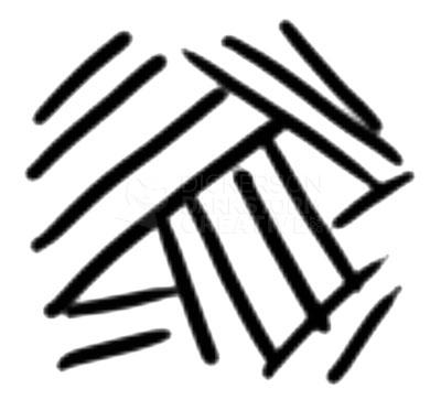
My brush settings usually end up on the default “Airbrush Soft Round 50% Flow” setting, and that’s good enough to start with. I put the opacity and flow sliders both up to 100%, then pick one of the brushes labelled “Heavy Crosshatch” (there are a few). It looks like this:
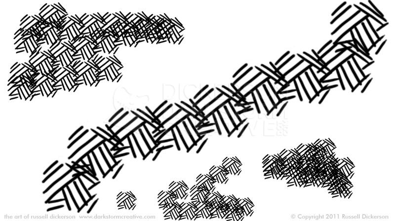
I prefer to leave it at 100% opacity/flow, but certainly change that for your own effects. The brush gives a pattern reminiscent of, well, crosshatching, though we aren’t going to be that careful with it. You can use it to paint heavy areas, or leave some loose at the edges:
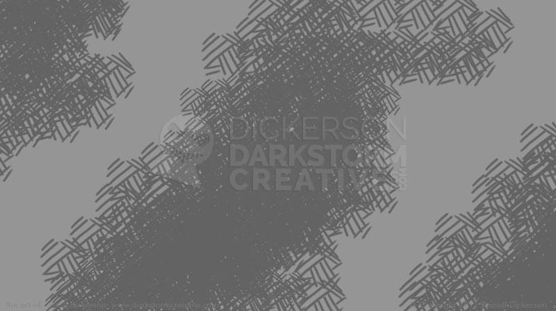
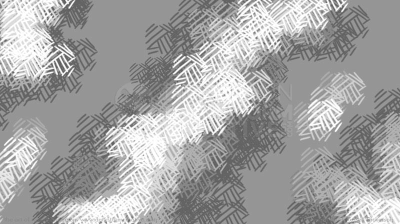
We’ll start with a grayscale image, and I’ve picked out a neutral gray as a background. On top of that (in this case, on the same layer), just slightly darker, I’ve added in a base color.
Depending on the effect you’re looking for, you can go slightly darker or slightly lighter at this stage. Each way gives a slightly different effect, so experiment with what you really need (even if you end up just adjusting the curves). From here, you just progressively add slightly lighter colors on top.
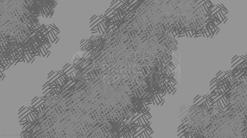
Gradually, you work your way up to white. To a certain extent, this is a random process. But I do tend to bring in the light colors from the wider base, to make it look more like highlights. There are usually fewer of the brightest lines as well, we don’t want to cover up the dark parts completely. I don’t normally resize the brush as I go, I prefer to keep them the same size throughout the layers unless perspective is needed.
Now we have a full range of grays to play with, and a general cloud idea.
I know, it doesn’t look like a cloud. Yet.
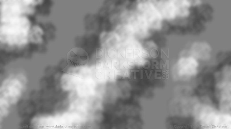
That’s where the Gaussian Blur filter comes in. Now, we’re not trying to kill off every texture here, unless you want great big balls of blurry cotton. We’re just softening the lines to just the point where they don’t seem like lines any more. This gives the clouds a whispy, but directional, texture.
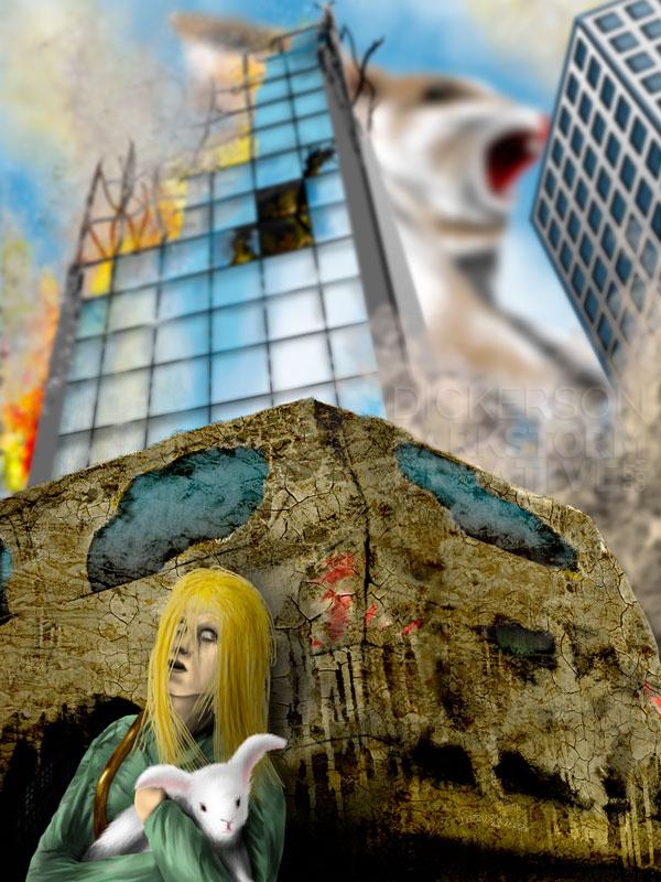
In this case, being longer clouds, they could easily represent smoke. The crosshatch texture breaks down into a nice mix, not only with the background but with the other layers around it. But it leaves behind a certain roughness, and doesn’t make the clouds look like just a few airbrushed strokes. In this case too, I messed with the grayscale balance (using Curves) to darken it some, to really give it a smoky look.
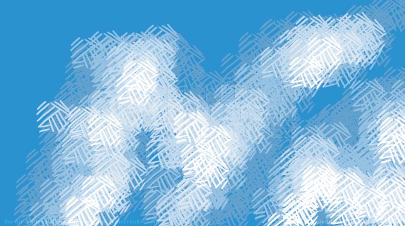
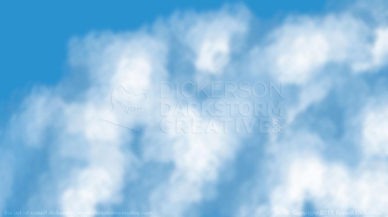
You can use the technique for general clouds of course, and in color. In this case, I pick a nice blue sky color as a background, and do the clouds on a new layer. You don’t have to of course, but the advantage is that you can use your cloud layer multiple times if it’s not set in the background. I also start with a lighter base color on top instead of darker, which gives the clouds more of the impression of being part of the sky and not on it.
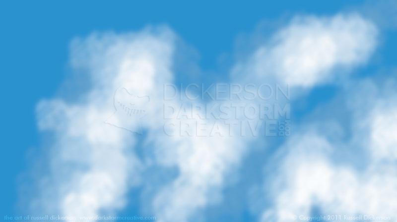
These clouds don’t have as much gap between them, to make them look more integrated. Then we go back to the Gaussian Blur filter.
Since the clouds are on their own layer, we can duplicate the layer and add more in the background. I then stretch and pull the new layers, and use the layer opacity to soften the clouds that are further back. You can even blur the further layers a little more to soften them. Be careful though, further blurring can make them look too forced, too smooth.
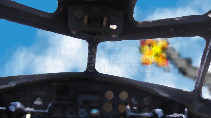
Then you can put the rest of your painting in front of the clouds. In this case, we’re looking out of a cockpit into a firefight.
The explosion and contrail (just not the “bits”) are done with the same technique. You just have to consider what type of cloud effect you need it for. In the case of the contrail, it gets tighter and darker as it gets near the explosion, and softer, wider, and a little more curved as it falls back towards us.
The nice thing with this technique is that you can really manipulate well what you want out of it. You can keep the detail almost to the point of seeing the crosshatch lines, or soften it to a whispy blur. It’s a handy technique to have, one that I use all the time.
