One of the great things that I like about digital art is the ability for programs (I use Photoshop) to let different layers of art interact. For example, I can have a painting of a character on one layer, with all the shadowing, anatomy, and so on, and on a different layer I can have a texture. By using different abilities in Photoshop (namely Layer Blending Modes), I can use the texture layer to give the character a different sense.
Now, that can mean a lot of things. The character might be dirty, or bloody, or dripping with water. It might even be a subtle texture of rough skin, that can barely be seen. Texture can get rid of the soft (or hard) look of digital art, and make it less “perfect”. Even when it’s subtle, it gives the eye something to grab onto, and since the art isn’t so smooth people accept it a little more (watch out, opinion given).
When I was doing my recent cover for Ray Garton’s book Vortex (Cemetery Dance), I needed to create one of the main characters for the cover, Pyk (see the full genesis of the entire cover here). I thought I had a decent layout idea, and a decent idea for the character, so I went to work painting him in.
I reached a point where his look and feel were complete, but I wanted to add some texture to him based on his description in the story. He’s a creature that’s been out in the woods, dirty, and very violent, and he has a blue tone to him. I debated manually creating the textures with the paintbrush in Photoshop (which I often do), but in the end decided to use manipulated photographic textures.
I have a lot of textures on my computer, some of which are even organized (in a half-ass way, believe me). I have a small digital camera that I take with me to many places, taking photos of trees, streams, buildings, goo, whatever might come in handy later. So, I started looking through my files for the right one.
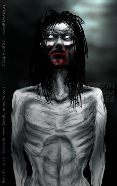
Here’s what Pyk looks like without a texture:
Let me just say up front, I knew Pyk had to be blue, so I started with a blue texture (you’ll see it). It happened to work quite well, so it stayed. But, for the sake of this article, let’s just say I didn’t do that. In fact, most of the time I do drift between several textures, and even combine some together, for different effects.
It also should be said that many of the following textures aren’t blue. But if the look of the texture had worked, that’s an easy thing to change in Photoshop. On each texture as well, I spend a lot more time dodging, burning, heal-brushing, actual brushing, and in general manipulating the textures until I get what I want. I rarely just get to slap in on there and go with it.
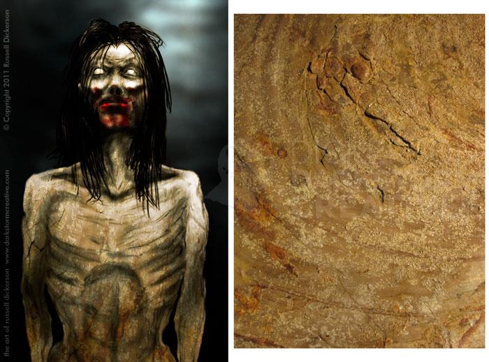
On to the textures, the first one is actually stone, petrified as I recall:
To be honest, I don’t think that one is too bad at all. It gives a rough, dirty look, and adds interesting shades to the art. Even if I changed it towards a bluish color, that color shift would be interesting. It’s maybe a little too spotty though, almost more like he’s been rolling in mud.
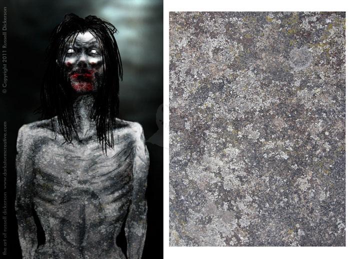
So, we try another one. This is a closeup of some mossy rock, weather beaten as it is:
The problem with this one is what you often see with texture work. It’s a nice texture, sure. But it’s not one that can translate into anything other than stony rock. Pyk looks far more like a statue than a dirty creature.
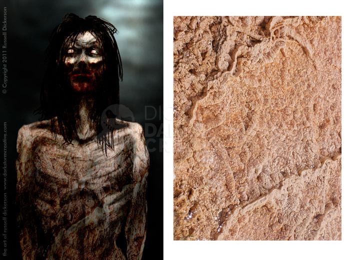
So, we try the next one. It’s a closeup of mud near a vent in Yellowstone National Park:
If Pyk was only bloody, this might be something to work with. It also might be handy combined with another texture, say the first one, to give him a dirty, bloody look. But by itself it looks more like he butchered a herd of cattle than something that’s been living on the land for a long time, and isn’t quite it. Still, it’s an interesting texture.
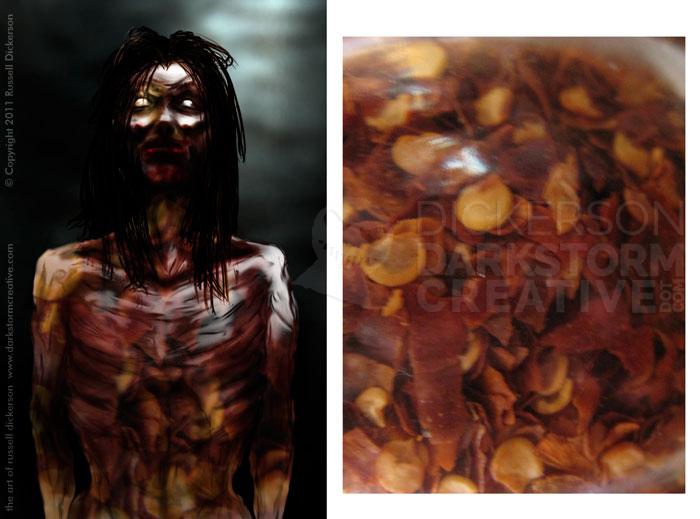
Next, I tried something a bit different, chili pepper flakes. Before you laugh, there have been lots and lots of textures that I used in the past that started out odd, and still worked well. Case in point:
To me, that has a wicked look to it. It’s translucent, like you can see what’s going on inside him. It gives him a shininess too that wasn’t there before, and gives me lots of really wild ideas for things to try.
Sadly, in this case, it would not have worked. It’s not at all like the story, and I think it’s highly important to follow the story when you’re doing covers and illustration work.
It’s not all in vain though. As with many of my experiments, that one gets logged in the old noggin for later. I have a feeling that effect will come in very handy.
When you’re working with digital art, and you have a little time, it’s good to experiment. Sometimes if you pick something very radical, you might find that it actually works. At the very least, even if it doesn’t work with one project, it might work great on the next one.
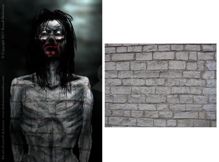
With the idea of radical in mind, here’s this one:
Now, of course it doesn’t work for the story, and in fact would need quite a bit of work to be good at all. But there’s something intriguing there, almost a golem or created creature feel. If you hide the bricks on the right and just look at it objectively, it’s quite curious.
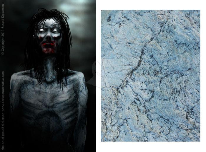
At the end of the day (as can be seen of the cover of the book), I went with a blue marble texture:
I gives him the subtle blue feel I was going for (and is described in the story). The lines in the marble translate very well to a dirty pattern, almost a feel of veins running under his skin. The roughness of the stone gives him a good look of being dirty overall, and adds a nice inconsistency to his skin.
Also important, it doesn’t lighten or darken the anatomy much, or the shadowing I already had in there. That’s the undoing of many a cool texture, the fact that they can interact so harshly with the art that they can’t be used. No matter how cool the look is.
Overall, textures aren’t going to make you the artist, and they won’t cover up crappy art. Anatomy still has to be right, composition well done, colors chosen well, and so on. But textures can help give flat art life, and give them a little something else that by themselves they might not have.
