Despite the bad way that my year is going, I still manage to get some great projects by some wonderful authors. Case in point, I was given the chance to work on author Ray Garton‘s new book, Vortex, out soon from Cemetery Dance. It’s a great honor not only to work with one of Ray’s stories, but to work with an always helpful and constructive publisher like Cemetery Dance as well.
For the cover, I wanted something that showed the main characters. The trick of it was, the creature of the book was both a character the reader has sympathy for, yet still very violent. Coupled with that, along with the actions of the characters, there’s a part of the story that deals with psychic powers as well. So the trick was to show both the real and the unreal, which isn’t always easy.
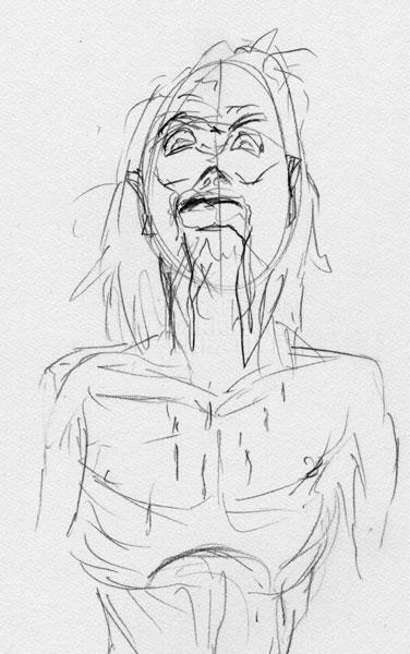
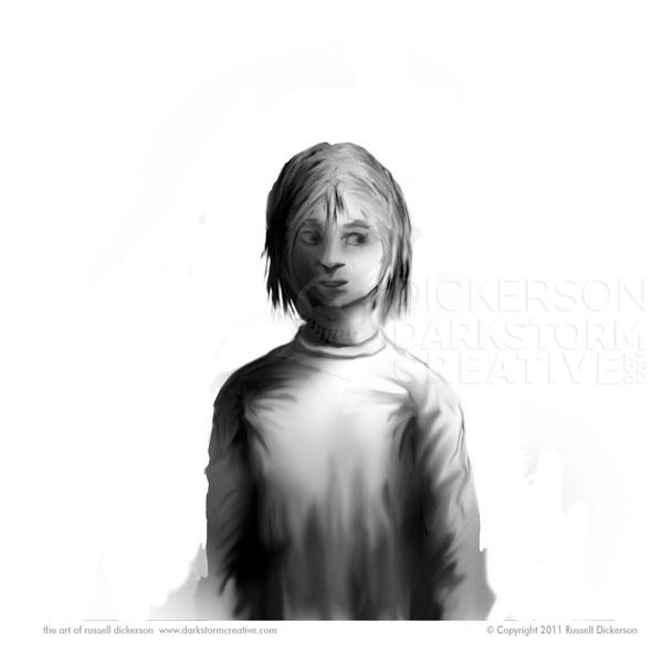
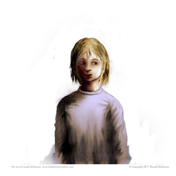
First though, as always with illustration work, we start with the initial sketches. Here’s the main character, Pyk.
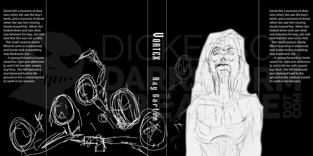
I then can take that initial sketch and throw it into a rough layout to get a sense of how things might work. The text shown is more for me than anything, to see how the text might interact with the art. You can also see in the layout a rough idea of the original version, of the other characters in the story fighting each other:
That was then sent to the publisher and the author, to see what they thought. They liked the idea, so I created a new Photoshop document and went to it.
I sometimes start with the character, sometimes the background, it just depends. Mostly I let what I feel like working on rule the moment, I’ve learned through hard lesson to follow the muse and not fight it. I might want to start on one piece, but that doesn’t mean it’s the one I’m meant to start with.
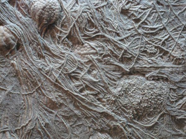
I made the background black, and added one of my textures to it. It started out looking like this:
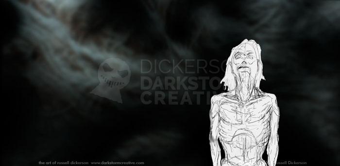
I then manipulated it on the black background, using copies of it, hand painting, masks, and layer blending modes. Then I put the sketch on top of it.
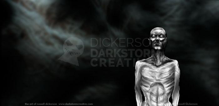
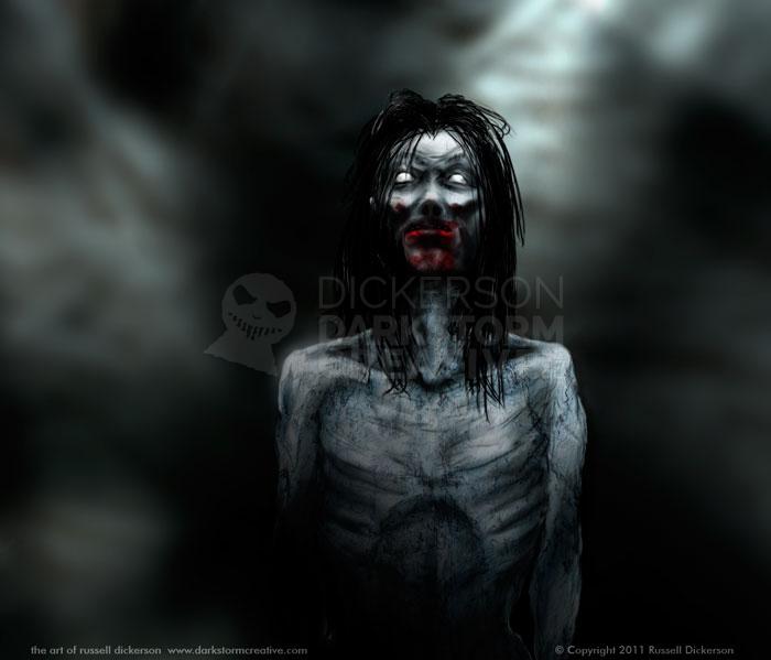
Next, I start adding Pyk’s real details (though I occasionally still screw around with the background). The character is extremely thin, at a level of starving that shocks the first character in the book, and I wanted to capture that. I also was looking for a balance of pity at his condition, but a subtle show of his violent nature as well.
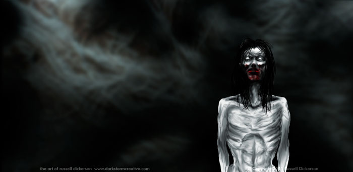
Then, I added a few more details, smoothed out some spots, and added his mangy, long hair. With that, I also added blood around his mouth, which adds a bit of dread overall. I also gave him a subtle blue tint, which is part of the character. Working with blue characters can be very tricky after Avatar (and even the smurfs), so it needed to be subtle.
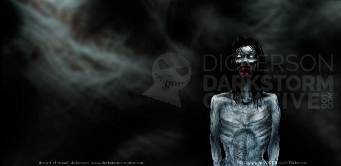
Being that the character lived away from civilization, and was quite rough, I added a texture to his skin as well.
Which for me added exactly what I was looking for in the character. There’s a certain sense of death, of wrongness with his skin, and yet (hopefully) the blue doesn’t pull you out of the image completely. The texture almost grounds it in reality, despite the color.
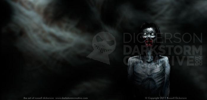
But Pyk stands out a bit too much here. He’s a bit too stark, and is alone versus part of his background. So, I added some further shadowing.
Now he’s part of the scene, not just a character in it. That idea is very important in most pieces, but in this case it’s something that has to be done. The whole idea is this sort of darkness of the mind, crossing reality with the psychic parts of the story, and he must be a part of it and not above it.
While working on one part of the image, I always have the other parts of the image in mind as well. Often that leads to the chaotic working methods I employ, but it also keeps me grounded in the overall idea. It’s easy to let one part of it take off and be its own thing, and I certainly don’t want that here.
With that, I ended up abandoning the idea of the people fighting on the back cover. I felt that it didn’t really fit, and it looked far more like people fighting independently than being any part of it. So I decided to focus instead on Pyk’s psychic relationship with another character, Penny.
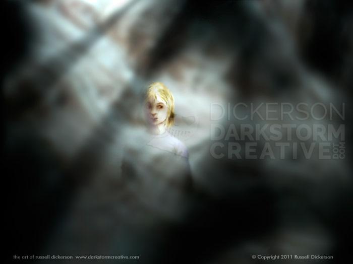
Penny is a girl who is brought in to read Pyk’s mind. But instead they become friends through this psychic link. To put her on the cover, I had to balance Penny’s growing friendship with the horror she knows he can be. She has to be there for him, but is still in many ways wary of him.
I started the same way, with a base construction of Penny.
Sometimes, I’ll let the colors get worked in the main area, but in this case I decided to make Penny a Smart Object in Photoshop, to keep her textures and parts together.
I went in and added colors and textures to Penny, and manipulated both layer blending modes and masks to get what I needed. I painted her completely first as opposed to only the parts that would be seen, as I think that’s a better way to go.
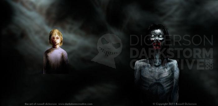
Then I put her in the full image with Pyk.
She created a nice balance with Pyk, and made the back cover of the book more interesting than just the texture. I think she adds more mystery than just the people fighting as well.
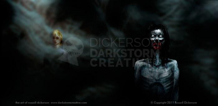
However, she was also too strong in the image. She’s in focus and very bright, which takes your eye off of Pyk and distracts from the intent. So, using masks and blending modes again, we knock her back some.
The focus has returned to Pyk, but Penny is now too far in the background. It’s a back and forth game, and it can be tricky to get the right balance.
One way to get the balance is to try other textures and colors on top of the image, and see how they interact with the layers below. In this case, a simple area of white highlighted the background quite well, and gave Penny just enough highlight to show well.
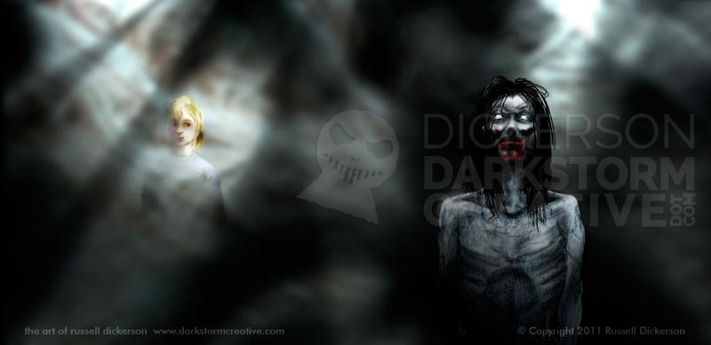
As I was trying it out, it occurred to me that the white layers on top, when blurred a bit and set to “overlay”, gave a nice feel of lights coming into the smoky areas. That gave it a nice idea of the light of reality shedding light in the darkness, and I went with it.
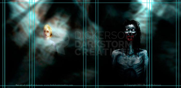
Here are the areas where the white is, highlighted with the selection tool:
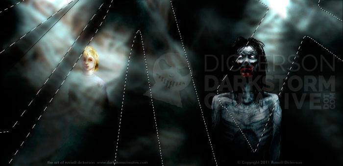
The highlights really added to the effect that they are both within this environment, not above it.
I don’t have them on every image here, but usually I leave the guidelines on while I’m working. I set guidelines for various things, including bleeds, cuts, margins, the spine and flaps, and in general any area that I need to be aware of. As a graphic designer, even if I’m not doing the design part of a book I still want to create the art so that it’s ready to use in a layout.
So, ladies and gentlemen, here is the completed cover of author Ray Garton’s wonderful book Vortex, from Cemetery Dance Publications. I’ve added a couple of closeups as well.
