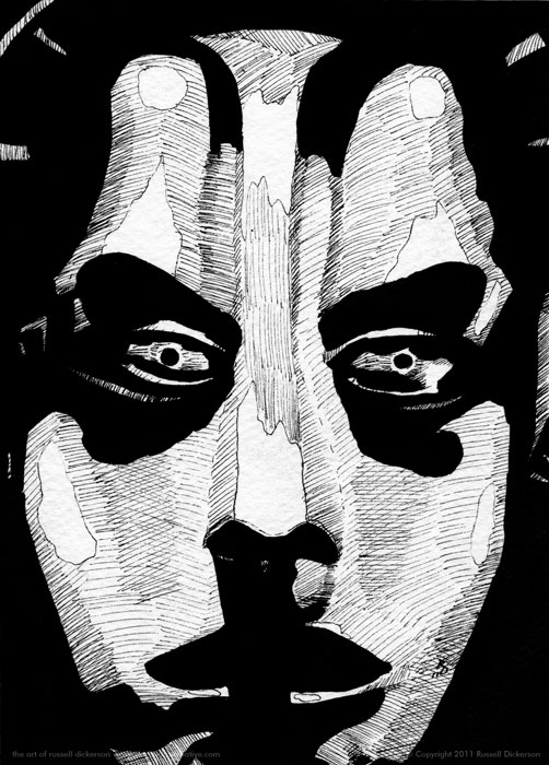
I’ve always loved the image of the female robot from the film Metropolis. It’s a very streamlined, very cool design, and well ahead of it’s time for when the film was made.
I’m not sure I captured it as well as other ink works I’ve done, but I’m still happy with it. I think it still has a metallic look (tricky with ink), and certainly looks female.
Believe it or not, sometimes making a piece of art look like a particular gender can be a challenge, especially in a case like this where the robot is really an idea of a woman, not an actual human. It’s a subtle difference, but it’s there in the character on film. The design had to pull off female sensuality, and yet be very cold and heartless.
I chose a pretty close crop with this one, and I lost a bit too much of the arching halo that sits on her head. I think it still works, but the image overall is now more of just a simple woman.
Really, I can’t complain about that. At least it doesn’t look like a man. I think.
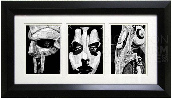
Here’s what the set of three looks like, which I’m hoping to put in the local art store (on their wall) tomorrow:
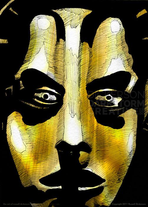
As is often the case too, I couldn’t help myself and ended up with a digitally colored version as well. I picked the goldish color that you often see in the posters for the film, though the film itself is black and white.
