On Thursday, I posted my newest ink/digital artwork, of Peter Cushing’s Grand Moff Tarkin character from Star Wars. I decided today, while taking a break between art pieces (and while my internet is working) to upload this article about how it was created.
I like to post these kinds of articles for a couple of reasons. One, there people out there who’ve said they like to see the process, and I’m happy to oblige. For me, it gives me a chance to review my processes, and see where I might make things better. It can also lead to a sense to consistency, in that I can compare how things are going now with how they went before.
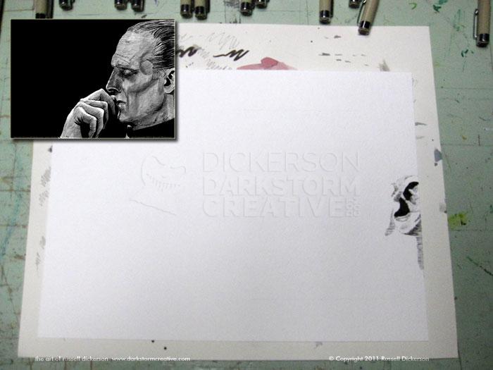
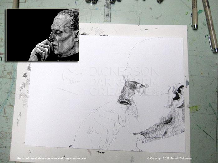
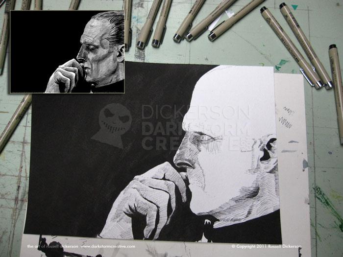
First off, and usually the hardest part of all, is where to start actually inking. I like to start on a hard edge, it gives me a sense of direction and a sense of location, and in this case, after some debate, I went with starting at the ear.
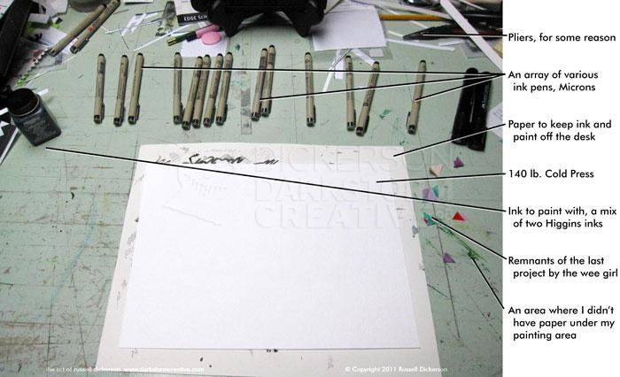
In some cases, I’ll just start inking and go. In other cases, like this one, I’m looking for more relative accuracy, so I tend to lightly use an outline. Usually I just use a .005 Micron pen for that, maybe an 01, but not larger. I want a hint of line, but one that, more or less, will disappear in the crosshatching later on.
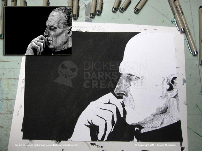
I sometimes will hit a place in my head where I just need to know what’s going on in the rest of the image. When I’m doing digital work that’s easy enough, I just switch layers and work on the background. With ink of course that’s not the case, and I’ll reach a point where I just want to add in the black background.
I think it helps my brain settle down a bit, and stop concentrating so much on tiny areas and remember that it’s an entire work. Sometimes I’ll just use a brush pen to add the black areas in, but, especially on larger areas like this one, I’ll get the bottle of ink and brush in the inks.
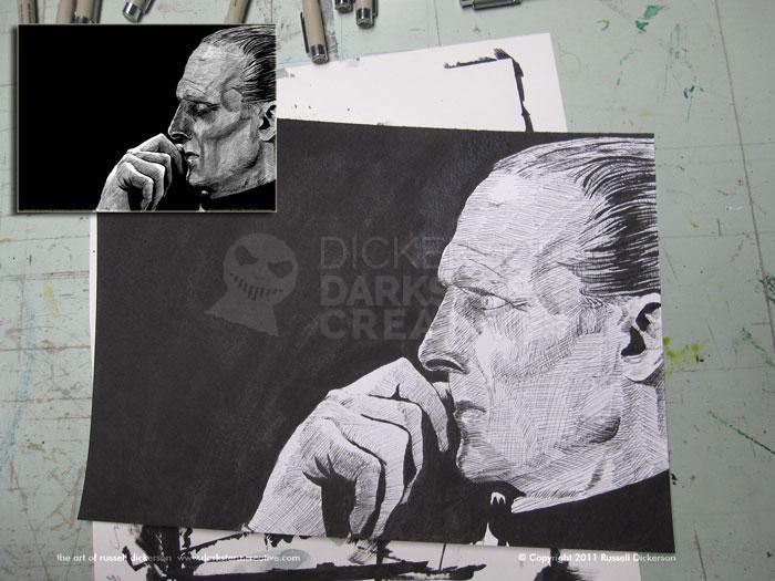
I decided to start adding detail to the hand, and leave the face alone for a bit. I was more nervous about the hand than the face, so I wanted to give it a bit more love. It could have easily swamped the works had it gone badly, but it went fine enough.
Tarkin at this point is more or less fully inked. At this point, I tend to just tinker a bit. Fixing lines here and there, darkening spots that may need it, that kind of thing. Once that’s done, it’s a decision of what “done” really means.
I liked how the crosshatching came out, but I thought it was missing something. This is often the place where I mess everything up, but I also believe that experimentation is key to being an artist. I decided it would look better with an ink wash on it.
For those unfamiliar, an ink wash is where you take your art over to the sink and attempt, with soap and water, to wash the ugly crap off of it, resulting in a newly beautiful piece.
Ok, I suppose that’s not actually true. An ink wash is taking your ink and diluting it (I normally just use water). Then you brush it on, and the ratio of ink to water determines how dark the ink wash will be. It acts in a similar way to watercolors, in that they tend to be quite soft.
You can leave a lot of ink in the water, and get a darker image. You can also put only a little ink in the water, and then gradually let it build up in layers on top of each other to get darker areas. I tend to do the latter, but I dabble in both certainly.
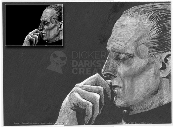
Once I’ve decided not to just throw away such work and run away sulking, it’s time to scan it in. There are no magic settings in Photoshop to get things right, and there are a million ways to correct things, so I won’t get too much into that.
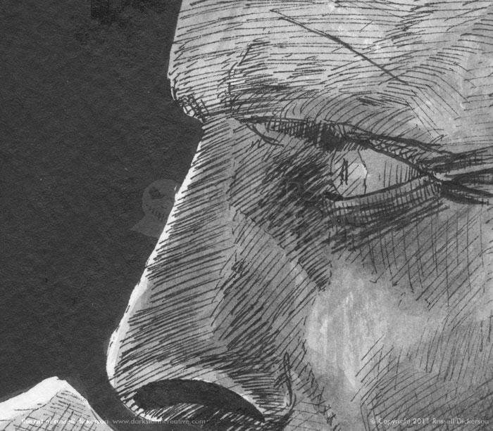
What I will talk about however are some of things you might see when scanning. In this case, as you can see below, the scanner picks up everything. I mean, everything. Which is good, the whole point of the scanner is that it gets as much of the image as it can.
What I run into a lot though is the paper. The paper stock I use is a watercolor stock, 140 lb. Cold Press. It’s a very heavy stock, with a strong texture in it, which I like to ink with. I tend to be a messy ink artist, and the Cold Press absorbs much of the ink when I’m working and causes me less trouble.
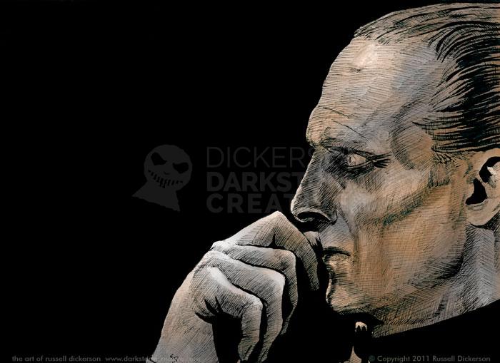
The scanner picks up the texture of the paper, which you can see in the little ripples below. Especially in the black areas, you can see the paper texture. The scanner also tends to fall on the side of gray versus black, which I prefer. I’d rather adjust things towards black in Photoshop than have the scanner assume an area is black. That way, we don’t miss important details that the scanner might otherwise ignore.
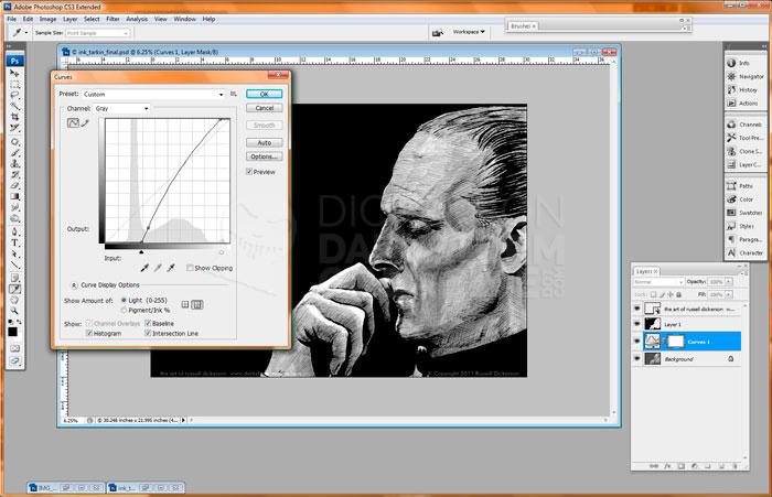
So, in Photoshop, we adjust things so that they look a bit better as digital works. That means improving the black and white levels mainly, increasing the brightness and contrast. I use Curves for that, and adjust things to where I like them. Again, there are no magic settings, and every piece is different. There are other ways to do this too, but I like this method.
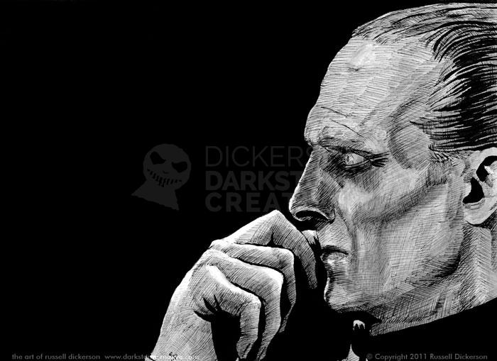
Voila, we have a new ink piece that looks good online when I post it.
Of course, Photoshop does some other trickery as well, and being both a traditional and digital artist I like to toy with things. I decided to try and add some color and effects to Tarkin, starting with the simple colors.
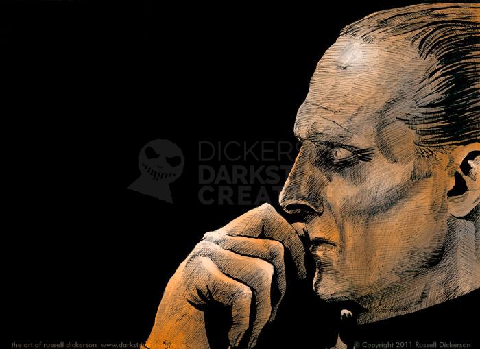
I just start as easy as I can, in case it ends up not going anywhere I’m not wasting a bunch of time. I resaved the Photoshop edited file as a new, flattened RGB file (mostly so I wouldn’t do anything stupid, like save over the other edits). I made the ink layer it’s own layer, then turned the blending mode to “Multiply”. That eliminates the white parts of the ink, and on a new layer under the ink I toyed with different gradients.
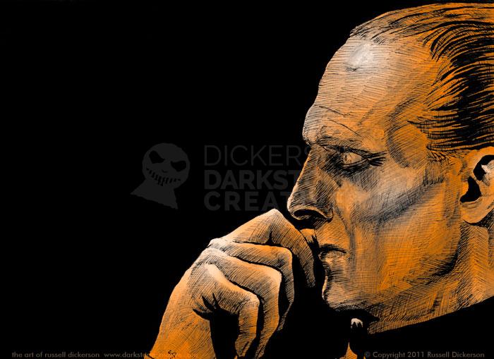
I ended up liking this orange-to-white gradient, and, after some masking, here it is.
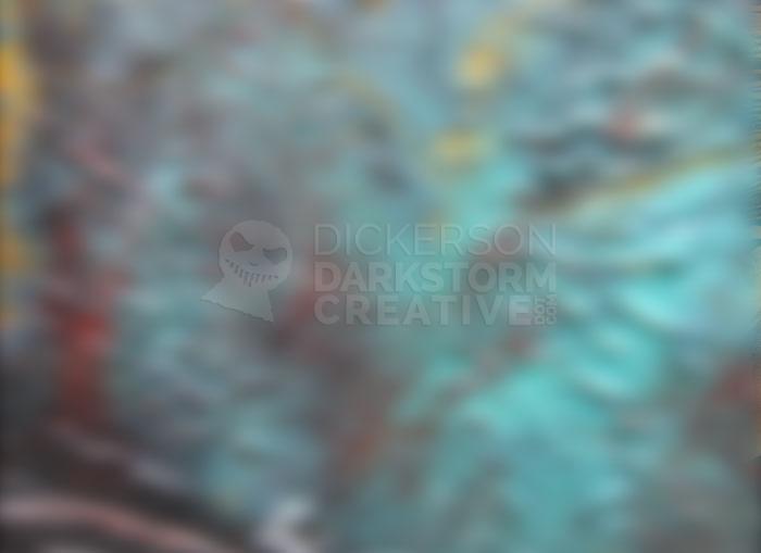
I thought that was a decent start, but too strong in color. Instead of editing the color, I decided to try putting textures on top of the gradient layer. Here’s the one I went with, a blurred closeup of paint.
I set the blending mode of that layer to “Saturation”, which softened the orange effect and highlighted some spots quite nicely.
But I didn’t just want to kill the orange, so I used a layer mask on the texture layer. That let some of the orange effect through, but kept the other colors and texture in the important parts. It gave Tarkin an unusual, but still somewhat ominous, color.
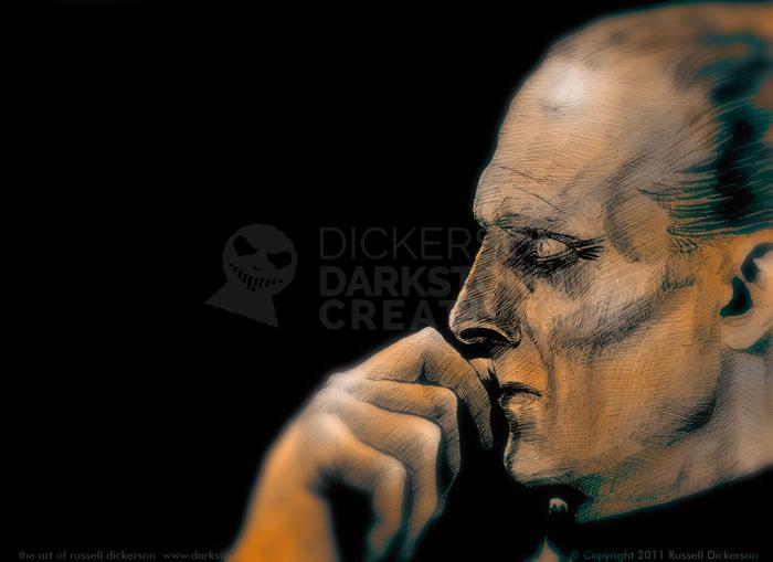
I thought it still felt a bit strong, so I duplicated the ink layer and blurred it. That gives me a base to start with for focus-related effects, and from there I could just mask out where the focus should be, revealing the sharper original ink underneath.
With the blurred ink masked, I turned the color and texture layers back on. It left a bluish artifact around certain areas, but I thought that actually added to the effect nicely, and left it alone.
Below is the final result, the digitally colored version of Grand Moff Tarkin. Opinions, as always, are welcome.
