As you may have read from a previous entry here (you do read EVERYTHING of mine, right?), I recently paid a visit to the Wadsworth Atheneum Art Museum in Hartford, Connecticut. One of the nice things about being in an art museum is the chance to take in a surprise painting, one that you didn’t expect to see.
That could mean quite a lot of things, from a new piece or new artist you’ve never come across before, to a famous piece that’s just sitting there waiting for you to walk by it. It’s the latter that happened at the Wadsworth Atheneum (ok, it was both, but that’s for another day), and here’s what I found snuggled in amongst the other pieces.
This is Norman Rockwell’s The Young Lady With the Shiner (1953, Oil on Canvas, 34″ x 30″), one of Rockwell’s obviously humorous pieces. That’s certainly why it caught my eye when I was at the Atheneum, I’d seen this particular piece in plenty of books and magazines before.
Seeing it in person really gives you a different idea of Rockwell’s styles and techniques, something you can’t get too well in a book or just on the web. I’ve said it before, when you are at a museum seeing a work in person you just get such a different idea of what the artist was really going for, and how they made it to the finished piece.
So, take a real close look at the image above, which is typical or slightly larger even than the average web version. I’ll wait.
…Aaaaaand we’re back. You start to get certain ideas and assumptions from seeing the piece at the size above, but you get more of the idea of the piece (especially the humor) and not much of how Rockwell pulled it off.
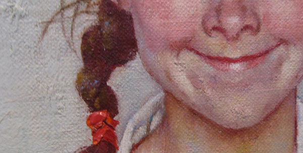
Here’s a close-up of the girl, the centerpiece not only literally but emotionally as well:
What you immediately notice now is that the girl isn’t smoothly skinned, and the art isn’t glossy like you’d expect from the typical magazine illustration. Her skin is made of quite a lot of colors, all blending together in unique ways to give her a certain look.
There are the normal reds and skin tones you might see, but there are also greens and blues in her skin. The different colors give her a uniqueness, one that not only sets her apart, but gives her a life of her own.
At this close too, you can see where the ribbons in her hair are thick with the paint. At that thickness, the light is not only created by the artist, but there is also a new light introduced when you are standing in front of it, a different feel that a scan in a magazine might miss. A texture that Rockwell purposefully left in to give those parts their own believability.
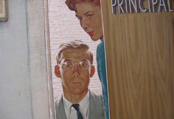
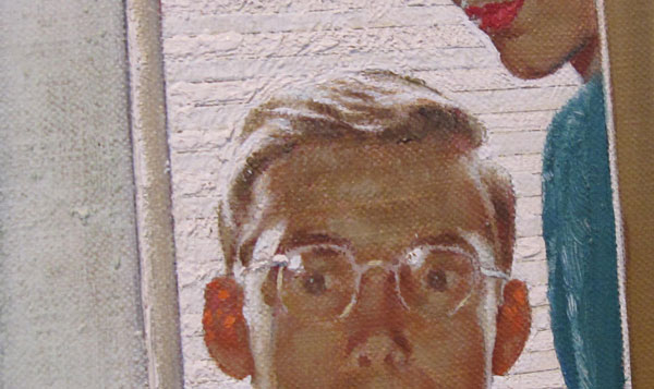
You can also see how artists often deal with objects (and people) that are in different areas of the image. In the full version onscreen, you notice that the principal and the woman are looking on, and your imagination takes it in. On a closer look, you can see that, while there is plenty of detail, Rockwell also left this area quite a bit less defined than the rest.
Rockwell doesn’t really skimp on the image, but he also understood how it would be recreated and at what size it would end up. It of course saves time to do less detail in this area, but also when it’s reproduced much of that detail would be lost anyway.
By leaving this area less defined, it also sends the viewer’s eye back to the girl for more information. Sure, the principal and the woman help set the stage for the gag, but they are the window dressing to the image. Rockwell leaves them slightly less detailed, and in the long run it works to help highlight the girl even more.
It’s that seemingly high detail that often makes the images look so fascinating. But it’s interesting to see artists that know where that detail needs to be exacting and where it should be looser, to give it the idea of detail.
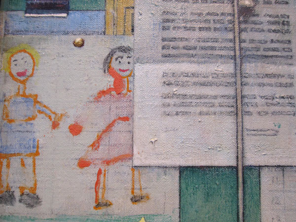
The viewer’s brain will fill in that this is a bulletin board, and that it’s a combination of work by children and adults. Your brain sees it, makes note of it for the overall image, then moves back to the girl. It helps sets the stage, but doesn’t interfere with it.
It’s a trick of the detail that works well, and it’s only upon close inspection in a museum that you can really see how an artist like Rockwell creates his work. You can also see a texture in the real painting, something you can’t get very well from a computer. You can see the roughness of the canvas where the children’s drawings are, and the note pinned to the wall, the drip of the green paint under the note.
For me, that’s the most important part of the museum trip. This isn’t just a picture of something, or some image to fly by on a website. I can see the individual strokes that someone’s love put on this canvas. I can see a line that, close-up, is a little crooked. I can see a big glob of paint on a manufactured note on a fake billboard in a painting, and know that the artist was a living, breathing soul too, and not just a machine.
Opinions?
