Someone asked recently how difficult it is to use textures and other files within Photoshop to get different effects. I thought I’d post a quick blog on some of the techniques I use, most of which are pretty easy. I tend to experiment quite a bit with different ideas and looks, but here’s a general usage idea for textures.
We’ll start with a fairly normal pic, of the Aztec Theater (which is a bar now I believe) on San Antonio’s Riverwalk. It’s a run of the mill, touristy pic, so it should be fun to use.
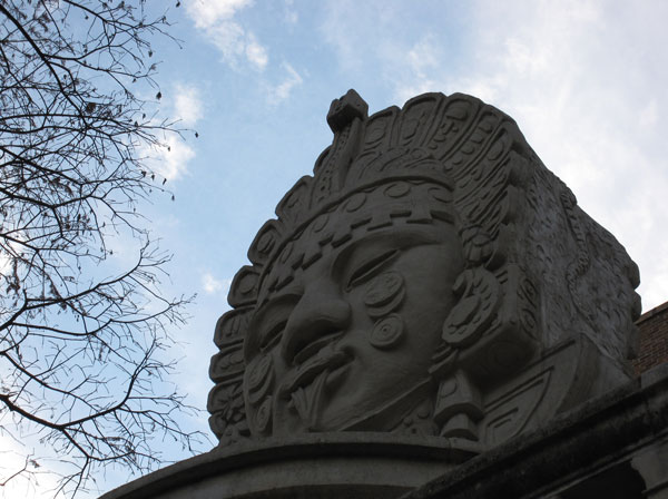
It’s definitely not dramatic enough (come on, I am a horror artist), so I’ve grabbed a couple of textures to use to make it a little more attractive. Now, there are plenty of places to get free, fantastic textures (cgtextures.com, imageafter, etc.), or you can take your own pics to use. That’s what I’m using here, a couple of shots from my own files.
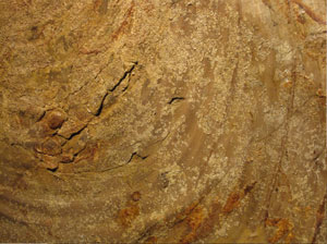
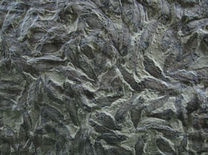
Both of those are from exhibits at the Denver Museum of Nature and Science. The first is an ancient rock as you’re leaving the exhibit area, the second is nearby, of a particular kind of fossil (which I didn’t apparently make note of). Really anything can be used as a texture, even the mundane. I often use shots of chili peppers, and even oatmeal to use in my works.
I picked the first image and added it on top of the aztec. Then I mess around with Photoshop’s Layer Blending Modes on the texture layer. It takes a bit of imagination, and you have to roll with it some, but you can often be led to interesting places. Each mode has a specific idea behind it for the effect it will give, but I’m far more likely just to cycle through them and find the ones I like. Here’s what you get when you put the texture layer on “color dodge”:
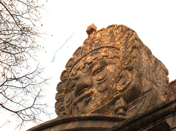
This is what I mean by “roll with it”. You blow out the sky something fierce, but my eye was immediately drawn to the gold-flake idea that’s there now. It’s changed the whole picture into something new, and now we just have to fix it to our liking.
I chose to select the blue using a channel mask, which is a little imperfect in this case since there is a bit of a blue cast in the aztec itself. But it’s not enough to throw off the works, and in fact it helps to blur things a bit and keep them combined.
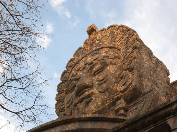
Then, being an impatient glutton for punishment and obsessive about tinkering with things, I added a different texture on top:
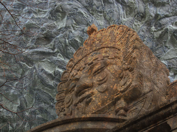
No, believe it or not a zombie monkey did not in fact crap on your monitor.
But this is where the “roll with it” idea comes along again. This texture is imperfect, but you can use elements of it with other Photoshop effects to enhance the cloud part of the image. You aren’t going to be adding to the image, much like the “gold-leaf”, but rather a slight bit of enhancement instead.
We can steal the mask that covers the other texture and invert it, so that it (more or less) only affects the sky. From here, you can mess around with Photoshop’s filters and adjustments to get what you want. In this case, I used a radial blur (on “zoom”) and changed that layer’s blending mode to “overlay”:
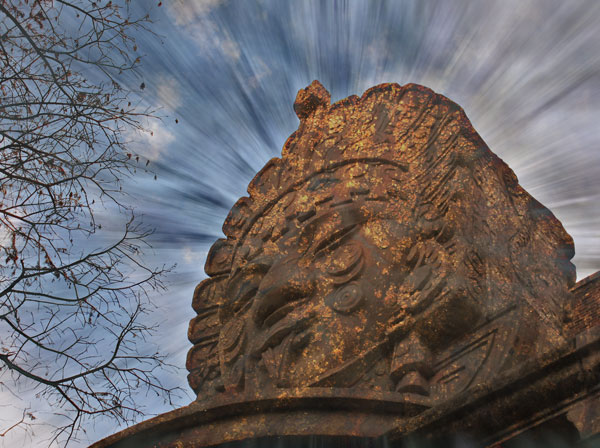
Which, while a bit cheesy, does give you a bit of a different sense with the image. You can also go further by changing the blending modes some more, and get more of a “sci-fi” feeling:
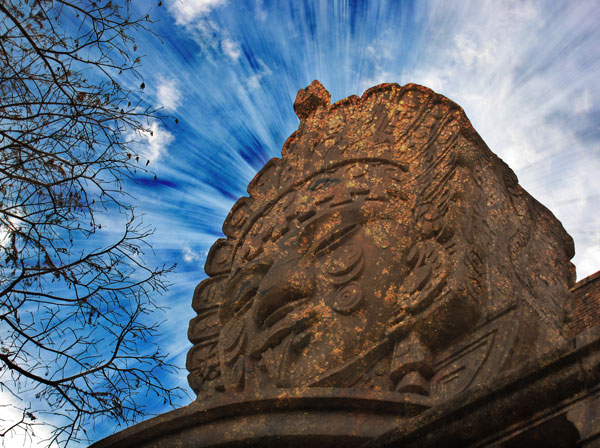
But, once in awhile, I like things to be a bit more subtle, so here’s my final idea:
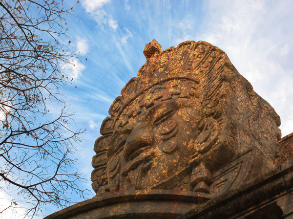
Go forth and experiment with layers, and see what you can come up with. It can be a fun exploration of photos, and of incorporating a different idea into otherwise normal pieces.
