Being an illustrator, and having been a big fan of engravings and inkwork for many years, I have a tendency to pick up on highly detailed artwork. Since these posts are designed to help me learn how to be better at what I do (and to entertain the billions and billions of devoted followers of this blog), I thought I’d pick something different. At least, if not different in the typical ideas that I like, different in technique or design.
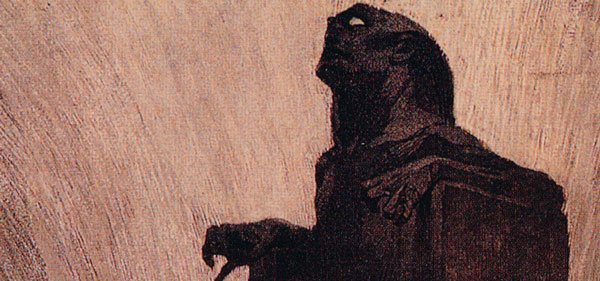
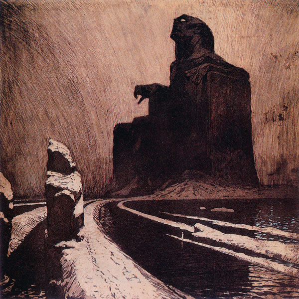
This is Frantisek Kupka’s Resistance, or The Black Idol (1903, Colored aquatint on paper, 13.7″ x 13.7″), which despite it’s fairly simplistic idea is still a striking piece. Several of the sites that I read about it say that Coppola modeled Dracula’s castle after the piece (which I found a handful of shots of here), which certainly seems the case from the small images I’ve seen online.
I can’t spout off about color much on this one, being a mono-/duotone sort of piece. There’s also not a huge amount of detail to talk of. No, this work is all about contrast, and using light and shadow to make your point.
Kupka uses those contrasts to great, emotional effect in the piece, and he tells his story with the simplicity of black and white. The brightness of the lower right and across the bottom bring your eye in, right to the path leading to the statue. At the same time, your eye is drawn by the darkness of the statue against the sky, a simple background that enhances the darkness of the statue.
Yet, the two extremes balance one another nicely. Neither is too dominant, and they both work together to form something greater than the parts. You are drawn down the bright path right into the darkness, pulled in by the whole over the parts.
Kupka also uses several design and layout tricks to keep your eye heading where he wants it. The angles in the art always lead you in the direction of the statue, whether that’s the angles of the path or the shadow of the smaller rock. The linework of the sky/background curves inward towards the statue, and is darker to the outside, bringing you back to center. The curve of the path itself almost gently brings your eye to the statue, defying the horror that seemingly lays within.
The piece is really a simple one, but in that simplicity is a great power. The lack of detail makes the image more natural, and at the same time more powerful. Kupka’s not saying that the path is right or wrong, good or bad, only that we must take the path with him. You can take it that you are entering into the darkness of hell, or that you are coming out of the darkness down the bright path to salvation. As with all great works, it’s up to you to decide.
Opinions?
