I thought I would return to the pulp art era again, I have a wonderful book by Robert Lesser called, simply, Pulp Art, which is fantastic. I think many of the artists in the book really set the stage for illustration art ever since, and I wanted to write a few blogs about them.
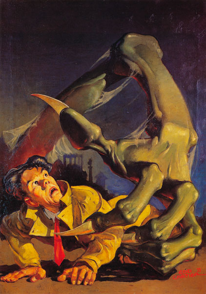
This is Edd Cartier’s cover for Unknown Fantasy Fiction, December 1939, and is a striking piece in both execution and in idea. There’s a real dramatic sense to the art, and it really would pull me in to read what’s inside.
I like Cartier’s use of color and contrast here. I think the bright yellow of the man’s jacket in the foreground fades nicely back along the green arm, back into the darkness.
There’s a real sense of depth here, and of a sense that (aside from the obvious claw) this isn’t a normal scene. Cartier uses the brightness and sharpness in the foreground to really help give us a sense of scale, letting the background blur and fade out nicely.
I like that the character’s face has a uniqueness to it as well, and that it’s not necessarily a “production” face. You come away with the idea that this is an individual, that there’s a story here to follow. Cartier doesn’t just give us a generic victim, he gives us a unique person with a unique (although probably shortened) story.
Above all though, I just like the idea of the art and how it was executed. I see it that this poor guy was knocked down, and was getting up in relative safety while the events in the background unfold. As he starts to get up BAM! GIANT GREEN HAND TO MESS UP YOUR NIGHT!
That’s what I like about many of the pulp pieces, and especially this one. There’s a story here, something that happened, or is about to happen (poor guy). If I saw this cover nowadays I would be drawn right to it, and in a cover you can’t ask for anything else.
Opinions?
ps – The image above comes from Lesser’s Pulp Art book, which is a fantastic tome on the sometimes forgotten, but brilliant art of the pulp era. I highly suggest you pick it up, try here for starters.


