![]() Before I brand myself as either only liking realistic art or only posting neoclassic/romantic art, I thought I’d add a little different look.
Before I brand myself as either only liking realistic art or only posting neoclassic/romantic art, I thought I’d add a little different look.
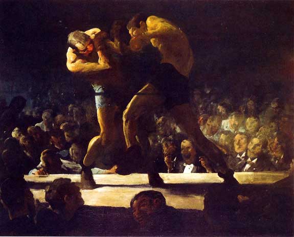
This is George Bellows’ Club Night (aka, Stag Night at Sharkey’s; 1907, Oil on canvas, 43 x 53 inches), a “looser” image than I’ve been posting so far. Ironically, Bellows also did at least two other boxing images which were much more realistic, but this one stuck out for me.
Bellows’ work here is a study of how to use contrast without resorting to sharp lines. He used the immense darkness of the arena contrasted only with the strong highlights through the center of the piece. It draws your attention right to the boxers every time, and no matter where else in the piece you might want to look, you are still drawn right back to center.
Bellows’ composition helps that effect perfectly. The angles of the boxers and their arms all point in similar directions, and the stage/ring comes to a point from right to left, helping the eye to follow back to the center. Bellows also puts the real center of the piece, the boxer on the left, just off center. The darkness of the boxer on the right draws you right in, and your eye almost follows the boxer right into the one on the left.
The colors also work beautifully here, a great touch to an already great scene. The blue in the left boxer’s shorts, combined with the high yellows of his skin, help to bring you to the immediacy of the red on his face. We understand through the color that this is who we wanted to win, but the great darkness of the other boxer looming over is surely his doom.
Bellows created a masterpiece, and iconic vision of everything the sport is. The colors and contrast in the crowd are subdued, but the boxers are in high contrast, a battle of light and darkness. Bellows uses all of his skill to really separate the crowd from the fight. The feeling of being a spectator in the crowd is strong and, though we are here at the scene, we are delegated to watching the epic battle rage.
Opinions?
Russ


